Home
What are the resilience dashboards?
The resilience dashboards aim to provide a holistic assessment of resilience in the EU and its Member States. In relation to ongoing societal transformations and challenges ahead, the dashboards assess resilience as the ability to make progress towards policy objectives amidst challenges.
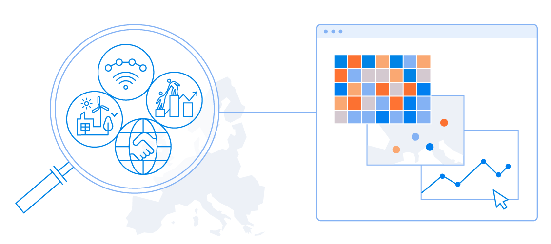
Through a broad set of indicators, the resilience dashboards assess the relative strengths and weaknesses of countries. They also help Member States to identify areas for further analysis and potential policy actions. The indicators span four dimensions: social and economic, green, digital, and geopolitical.
For a subset of indicators, they also show how the EU-27 is doing with respect to selected countries outside the EU.
The dashboards include a selection of indicators that show:
- Capacities - enablers and/or opportunities to navigate the transitions and face future shocks;
- Vulnerabilities - obstacles or aspects that can worsen the negative impact of the challenges related to the green, digital, and fair transitions.
The choice of the indicators was made with a forward-looking perspective, informed by strategic foresight. The indicators are strongly linked to relevant megatrends – long-term driving forces that will most likely have a significant impact on Europe’s future.
The detailed dashboards for the EU and non-EU countries are complemented by synthetic resilience indices. These aim to illustrate the overall relative situation of resilience capacities and vulnerabilities across the four dimensions.
![]()
The dashboards shed light on challenges and opportunities ahead, and help to navigate societal transformations towards a more sustainable development path. As such, they are considered an important step towards an integrated approach for measuring people’s wellbeing beyond GDP. This is crucial in a moment when the disruption of established lifestyles by the COVID crisis has intensified the debate on how we measure progress and conceive wellbeing, as also highlighted in the recent Porto Declaration.
Monitoring resilience
The 2020 Strategic Foresight Report put forward resilience as a new compass for EU policies. Resilience is defined as the ability not only to withstand and cope with challenges but also to undergo transitions, in a sustainable, fair, and democratic manner.
Strengthening the resilience of the EU and Member States is key in the light of ongoing societal transformations and potential expected or unexpected crises. That is also why monitoring resilience is important and why the 2020 Strategic Foresight Report proposed to develop resilience dashboards in four interrelated dimensions: social and economic, green, digital, and geopolitical.
The 2021 Strategic Foresight Report reaffirms the importance of monitoring resilience and the contribution of the resilience dashboards to measuring wellbeing with an integrated approach. Further, they help assessing the impact of Europe’s recovery and resilience strategy, including vis-à-vis other key non -EU countries.
The dashboards have undergone several updates, initially in Spring 2022 as they were aligned to indicators in the European Semester, and most recently in Spring 2023 jointly with the featuring of the new Resilience Annex in the 2023 European Semester Country Reports. All Country Reports include the Annex based on the dashboards to complement and reinforce current and future policy efforts, also bringing in new cross-dimensional evidence to the overall assessment.
There will be subsequent updates of the dashboards as new data become available. There may be potential updates in the indicator set as new indicators become available.
How are the resilience dashboards built?
As a follow up to the 2020 Strategic Foresight Report, the resilience dashboards are the outcome of a collective intelligence process involving European Commission services, Member States and experts from other institutions and academia.
Member States were consulted in the context of the EU-wide Foresight Network. A technical discussion with the Member States took place on 16 April 2021. Subsequently, the resilience dashboards were presented and discussed at the launch of the EU-wide Foresight Network at Ministerial level in Coimbra, Portugal, on 17 May 2021. The draft resilience dashboards were released on 30 July 2021 to collect further inputs. This broad consultation closed on 30 September 2021. This iterative development process embodying technical and policy considerations was concluded with the release of the Resilience Dashboards in late November 2021.
Connections with other existing monitoring tools
The resilience dashboards are built in coherence with other Commission frameworks, dashboards and scoreboards, exploiting synergies and avoiding duplications. Because of their holistic perspective, the resilience dashboards link with other multidimensional monitoring tools such as the Sustainable Development Goals indicator sets, both for EU and UN, or the European Pillar of Social Rights social scoreboard, the Transition Performance Index. They also relate to monitoring tools that cover specific thematic areas, such as the Circular Economy Scoreboard or the Digital Economy and Society Index, DESI.
Please see the Timeline section for the exact link indicator by indicator.
Related links
Resilience Dashboards
Resilience Dashboards
Synthetic indices
Synthetic indices
Timeline
Timeline
Indicator definition:
Class:
Source:
Data available in source from to
Methodology
Methodology
The dashboards present a multidimensional picture, whereby different indicators are placed next to one another, assessing the situation of countries across a number of dimensions. They use the latest statistical available year for each indicator (usually 2018-2021) as adopting a single reference year for all indicators would result in using outdated information for many of them. The main purpose of the dashboards is not to rank countries but to highlight strengths to be nurtured and areas for improvement, also in view of further country-specific analysis and policy action. For example, a specific indicator may point to vulnerabilities or bottlenecks, despite a good situation in other aspects. In some cases, a challenge is represented by more than one indicator. It is thus important to look at all indicators at the same time.
The dashboards will be regularly updated and data revisions in official statistics will be considered within the reference data sets.
How the dashboards are constructed: reading the dashboards
The resilience dashboards at the Member State level follow a relative assessment approach, i.e. each country vis-à-vis the others over a reference period. For each indicator, a scale of five colours indicates each country’s relative situation in the latest available year within the reference distribution, which is composed by the collection of values of that indicator for all Member States and all years in the reference period 2007-2017. The colour scheme is summarised in the figure below:

A dark blue colour corresponds to the position of the country located above the 87,5% of the reference distribution, light blue indicates countries falling between the top 12.5% and 37.5% (indicator position between 62.5% and 87.5%); dark orange indicates values that are in the bottom 12.5%; light orange between the bottom 12.5% and 37.5% of the reference data; grey is used to indicate values in the middle, falling between the 37.5th and 62.5th percentile of the reference sample. For instance, a high capacity for a country means that the corresponding indicator value is high in a historical comparison across all Member States. Since the colour scheme is relative, countries with the lowest (highest) capacities and highest (lowest) vulnerabilities could still do well in absolute terms (and vice versa). The arrows in the dashboards indicate the direction of recent changes. An upward arrow indicates a sizeable improvement in resilience with respect to the preceding five years (the average value in 2013-2016), while a downward arrow indicates a sizeable worsening. A dot indicates that no sizeable change has taken place over the most recent five years. An empty cell indicates that the five-year change cannot be calculated. In addition, the dashboards present the corresponding EU-level situation for each indicator. For the analysis at global level, the same methodology is applied, but the reference distribution considers the EU-27 and all non-EU countries. Individual EU Member States are not used in this case.
The synthetic indices
The dashboards are accompanied by synthetic indices that illustrate, in each area and dimension, the overall situation of resilience capacities and vulnerabilities of Member States and the EU. The methodology for the synthetic indices has been discussed with the JRC Competence Centre on Composite Indicators and Scoreboards, which has audited the synthetic indices that went into consultation on July 26th, 2021. The synthetic indices aggregate the relative situation of Member States and the EU across all indicators in the considered area or dimension. The balance among the broad areas and across vulnerabilities and capacities within each dimension ensures that there is no need to assign importance weights to the individual indicators. The synthetic indices should be read as an overall measure of resilience in relative, and not absolute, terms. In addition, as is usual for a synthetic measure, they do not convey the complete information provided by the full set of indicators in the dashboards, and as such, they cannot substitute them.
Complete methodology
JRC Audit
Open data
Open data
This section allows you to download data and metadata, in a bulk or customised download. It follows the European Commission's data policy, driven by transparency with the aim of contributing to innovation. It is a pillar of the development and implementation of scientific knowledge management at the Commissions level. It follows the commitments and regulatory basis of the Commission Decision on the reuse of Commission documents (2011/833/EU).
Metadata
The dataset covers four dimensions (Social-Economic, Green, Digital and Geopolitical) with more than 100 indicators from different public sources (Eurostat, OECD, World Bank, etc.), together with associated meta-data detailing sources, definitions, rationales, etc.. The target audience of such database are institutions in the EU and beyond, the MS, as well as academic partners specialized in the concept of resilience.
Dashboards
The dashboards aim to capture vulnerabilities and capacities in the four dimensions: social and economic, green, digital and geopolitical.
Synthetic indices
Synthetic indices illustrate the overall situation of resilience capacities and vulnerabilities by area and dimension.
Timeline
The timeline visualises the time series for each indicator from 2007 to 2021. It also shows the relative position of the selected country as compared to the others by using the same colour coding of the dashboards.
